skapi.com has a new look, and the dashboard behind it was rebuilt page by page. This is a short tour of the parts you will notice first: a database you can search from one bar, an advanced search that writes the query for you, a project page that tells you where you stand, and a dark mode. It ends with a promise about what comes next.

Search the database from one bar
In the previous dashboard, searching your records meant opening a separate dialog, filling it in, and closing it again to see the result. Now the search sits on top of the list. Type a table name, press Enter, and the list below is that table.
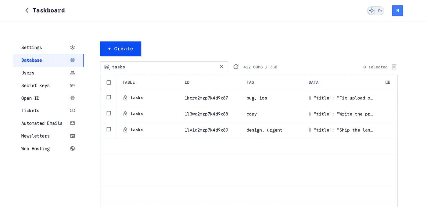
Search by table name. The icon in front of each row is its access group: a lock for private, a group for signed-in users, a globe for public.
The list itself is easier to live in. Choose which columns you see, drag them to the width you want, and click a row to open the record as a full page with a Back to list link instead of a dialog. That page has its own address, so a record can be linked: paste the URL to a teammate and they land on the same record.
Deleting many records at once used to be all or nothing. Now a batch delete removes everything it can and tells you which records failed and why.
An advanced search that writes the query for you
Click the icon at the left of the search bar and the advanced search opens under it.
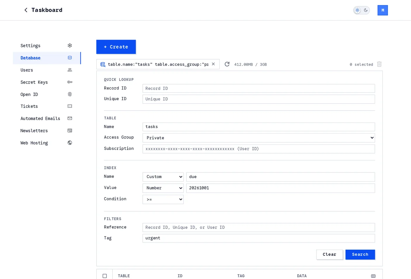
The advanced search. Every field you fill in appears in the search bar as text.
It has four parts, in the order you would think about them:
- Quick Lookup finds one record by its record ID or its unique ID.
- Table picks the table and the access group: public, private, authorized, a numbered group, or admin. It can also narrow the search to the records of one user's subscription.
- Index searches by an index you set on your records, or by one of the built-in ones such as the time a record was updated or uploaded, with a condition: equal, greater, less, or a range.
- Filters narrows the result by a reference or a tag.
Here is the part we like most. As you fill in the fields, the search bar above writes the same search as a line of text:
table.name:"tasks" table.access_group:"private" index.name:"due" index.value:20261001 index.condition:>= tag:"urgent"
The panel and the bar are two views of one query. Fill in the form and the text appears; type the text and the search runs. Once you know the words, you never need to open the panel again, and a search you use every day is something you can keep in a note and paste.
The Users page works the same way: a bar that searches by user ID, and an advanced search under it for email, name, the date the account was created and the rest.
A project page that tells you where you stand
The old dashboard split a project's basics over two pages. The new Settings page is one page, in the order you need things.
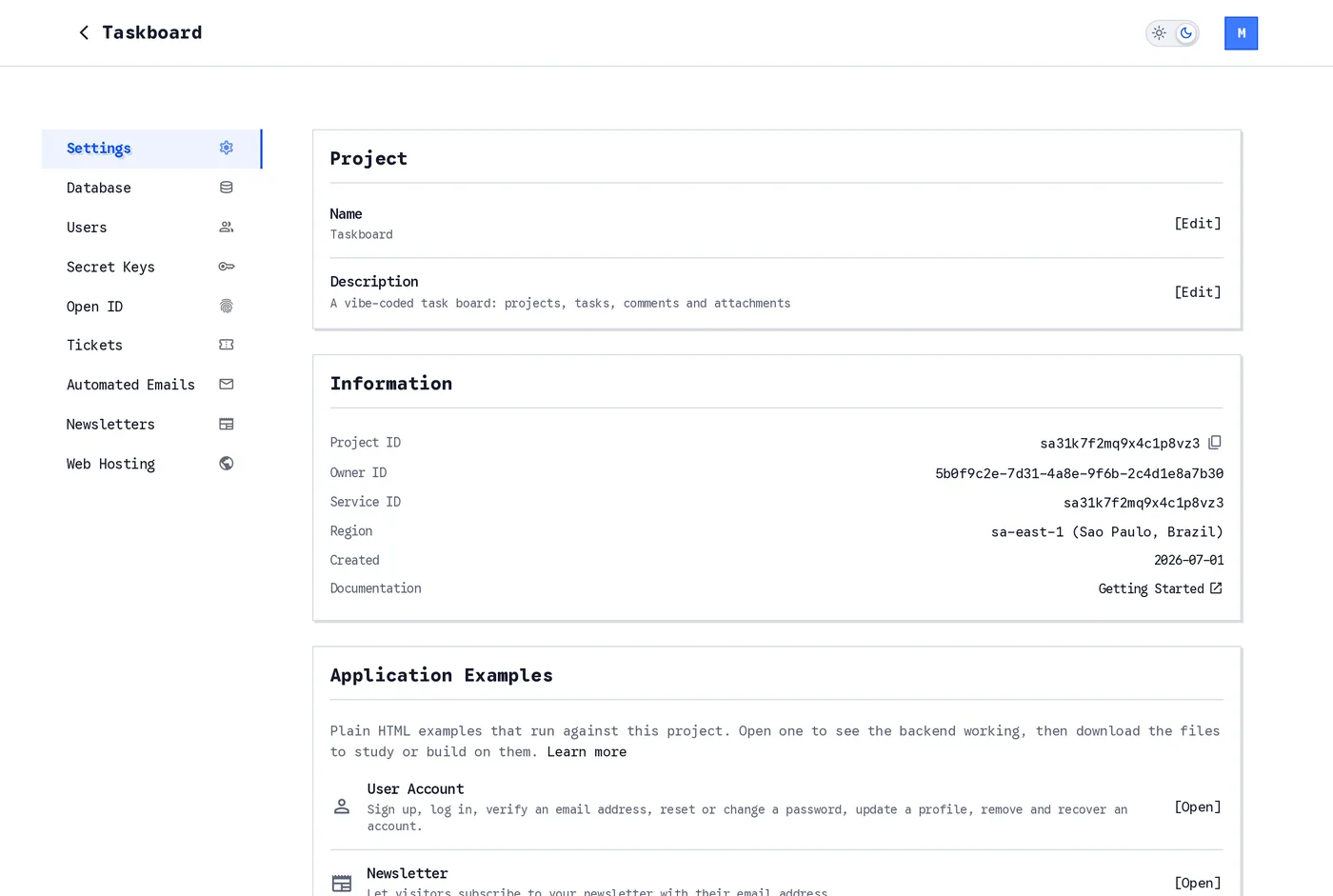
The Settings page. The Project ID is one click from your clipboard.
Information holds what you copy most: the Project ID, the owner ID and the region the project lives in. Application Examples opens working HTML pages that already run against your project: accounts, a database gallery, a newsletter form, realtime chat and video. For AI Agents downloads the prompt file for your coding agent under the name it expects, next to an opening prompt with your project ID already filled in.
Then the numbers.
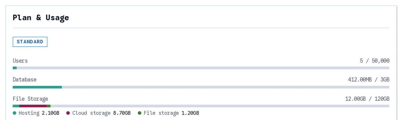
Plan & Usage. Every limit of your plan as a bar, and file storage split into what is using it.
Plan & Usage shows every limit of your plan as a bar: users, database, file storage, bandwidth, email sends and email storage. File storage is split by what is using it, so when the bar fills up you know whether it is your hosted site, your users' uploads or your own files. There are no surprises at the end of the month, because the month is on the page.
You choose the region
Creating a project used to pick a region for you. Now the form asks, offers the closest one first, and tells you the one thing you need to know before you continue.
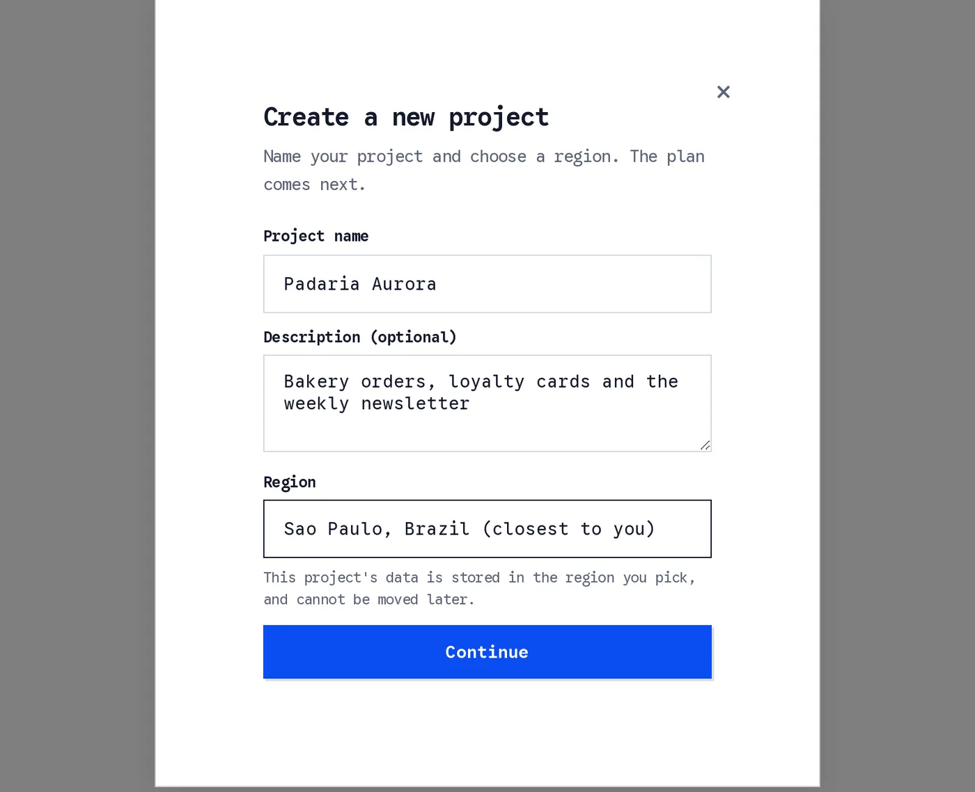
A name, a description, a region. The plan comes on the next page.
Dark mode
There is a switch in the top bar. Until you touch it, the dashboard follows your system setting. Once you choose, it remembers, and the choice is applied before the page is drawn, so there is no flash of the wrong theme when you open a tab at night.
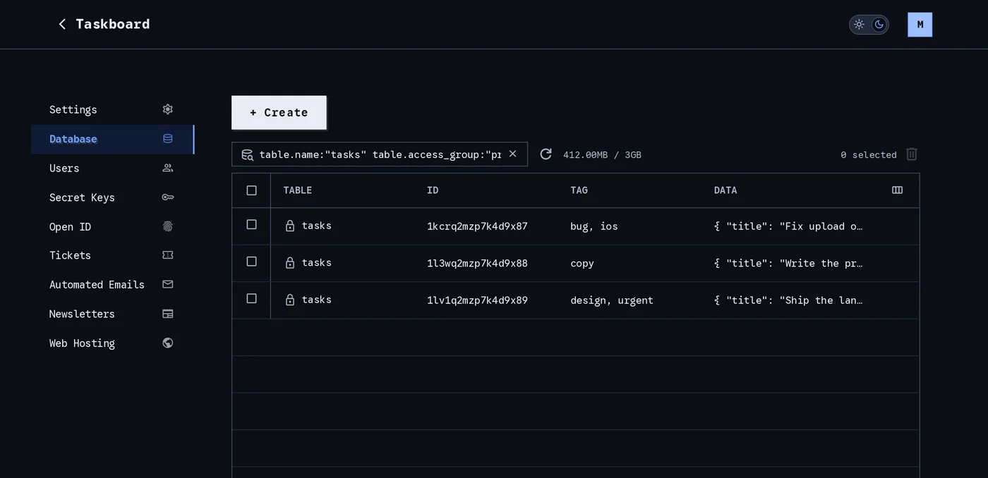
The Database page in dark mode. Every page of the dashboard has both.
The smaller things
Not everything fits in a screenshot.
- On a phone, the record and user tables become a list you scroll, loading more as you reach the end.
- Adding a user is one form with a switch between creating the account yourself and sending an invitation. It used to be two dialogs.
- Tickets is a new page: endpoints that accept a webhook, a link or a signed-in request and act on it, with their own logs.
- Newsletters are no longer two fixed lists. Create as many named groups as you need, each with its own subscribers and sending address.
- Automated emails can be previewed before you put a template to use, with the placeholders filled in or as written.
- Secret Keys and Open ID have the names you would look for, in a sidebar that fits on one screen.
What we promise
None of this was redesign for its own sake. Each page in this article was rebuilt because the old one made you take a step you should not have had to take: open a dialog to search, leave the page to find a number, guess which region your data went to.
We are a small team, and we are burning the midnight oil on exactly this. The backend you build on should be the quiet part of your work: fast to find things in, clear about what it costs, and out of your way. That is the standard we hold the dashboard to, and we are not done. Expect it to keep getting better, a page at a time, and expect us to tell you when it does.
If something in the dashboard slows you down, tell us at support@broadwayinc.com. Those messages are where the next round of work comes from.